Project Info.
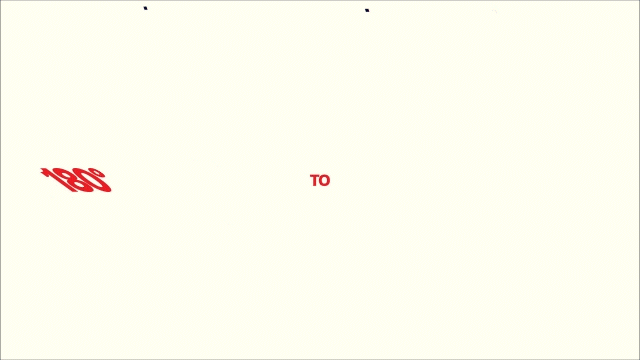
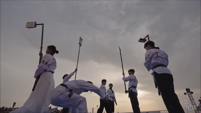
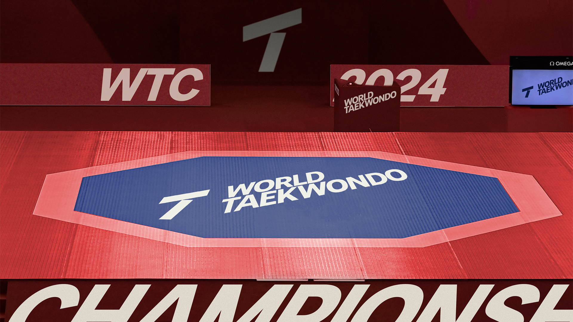
The rebranding strategy is centered around the concepts of unity and the essence of Taekwondo spirit. The logo itself consists of two bars artfully arranged at an 18-degree angle. This design not only subtly forms the letter 'T' for Taekwondo but also ingeniously captures the dynamic motion of a kicking action. The significance of the 18-degree angle lies in its association with Taekwondo's turning kicks, which come in degrees such as 180, 360, 540, 720, 900, and 1080. By incorporating this angular system, we've given prominence to angles like 18, 36, 54, and 72, both in the visual elements and typography.


SEPTEMBER, 2023
BRANDING, IDENTITY SYSTEM, ANIMATION, WEB, SOCIAL MEDIA, DIGITAL CONTENTS